
Get in touch
By clicking on the button, you agree to the privacy policy


JIRA is a very popular tool developed by Australian Company Atlassian.
It is used for bug tracking, issue tracking, and project management.
The main use of this tool is to track problems and bugs associated with your software and mobile applications. It is also used for project management.
It is used for bug tracking, issue tracking, and project management.
The main use of this tool is to track problems and bugs associated with your software and mobile applications. It is also used for project management.
Atlassian Jira

UX-Audit:

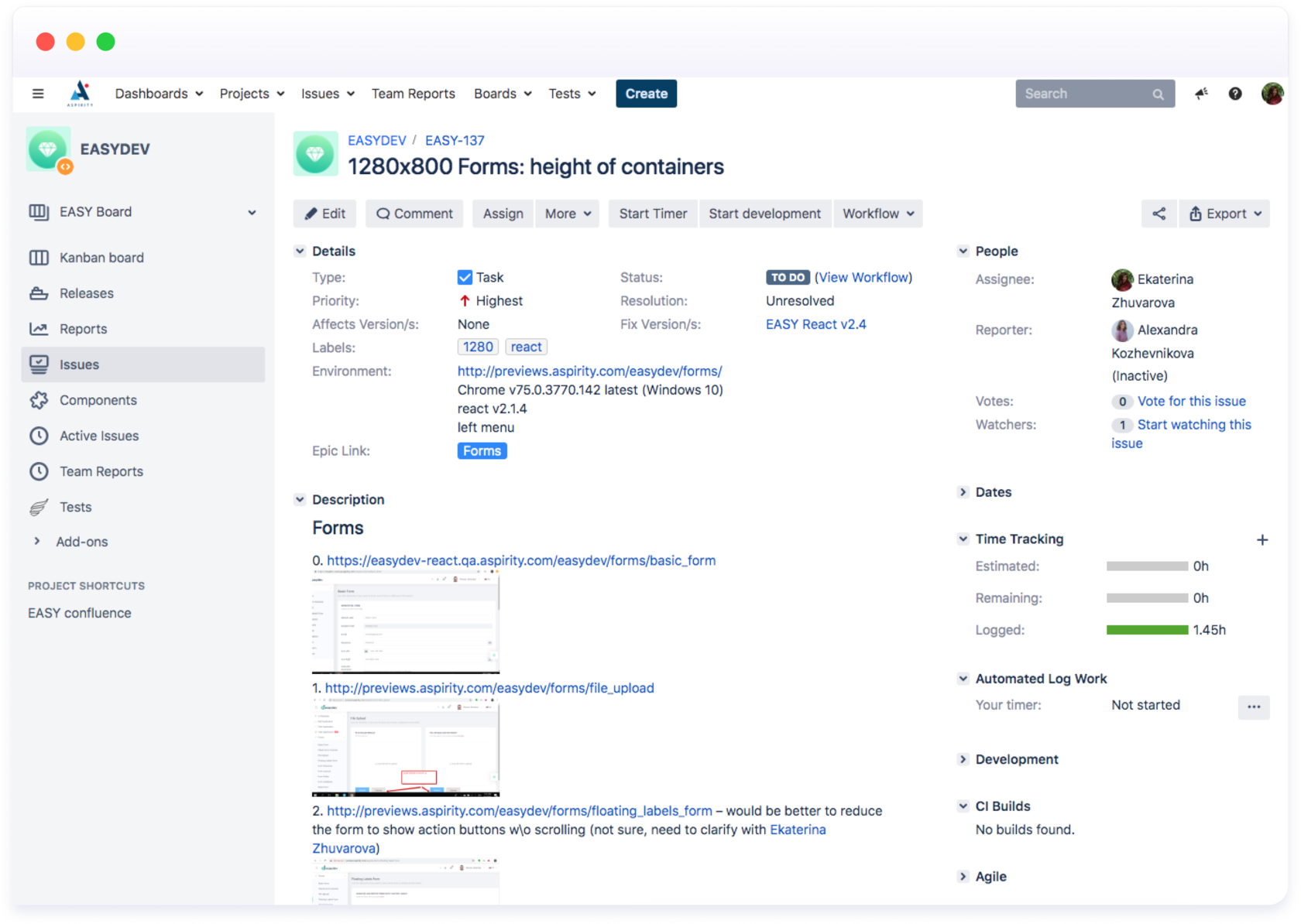
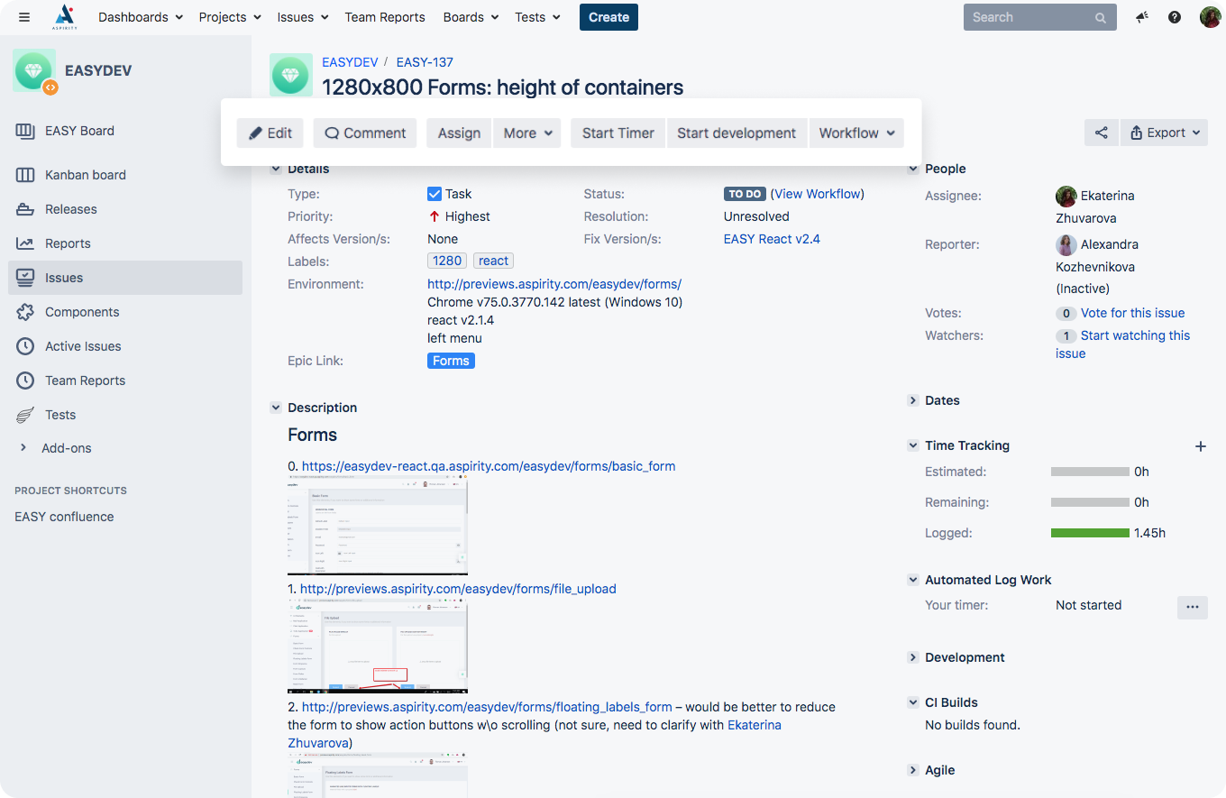
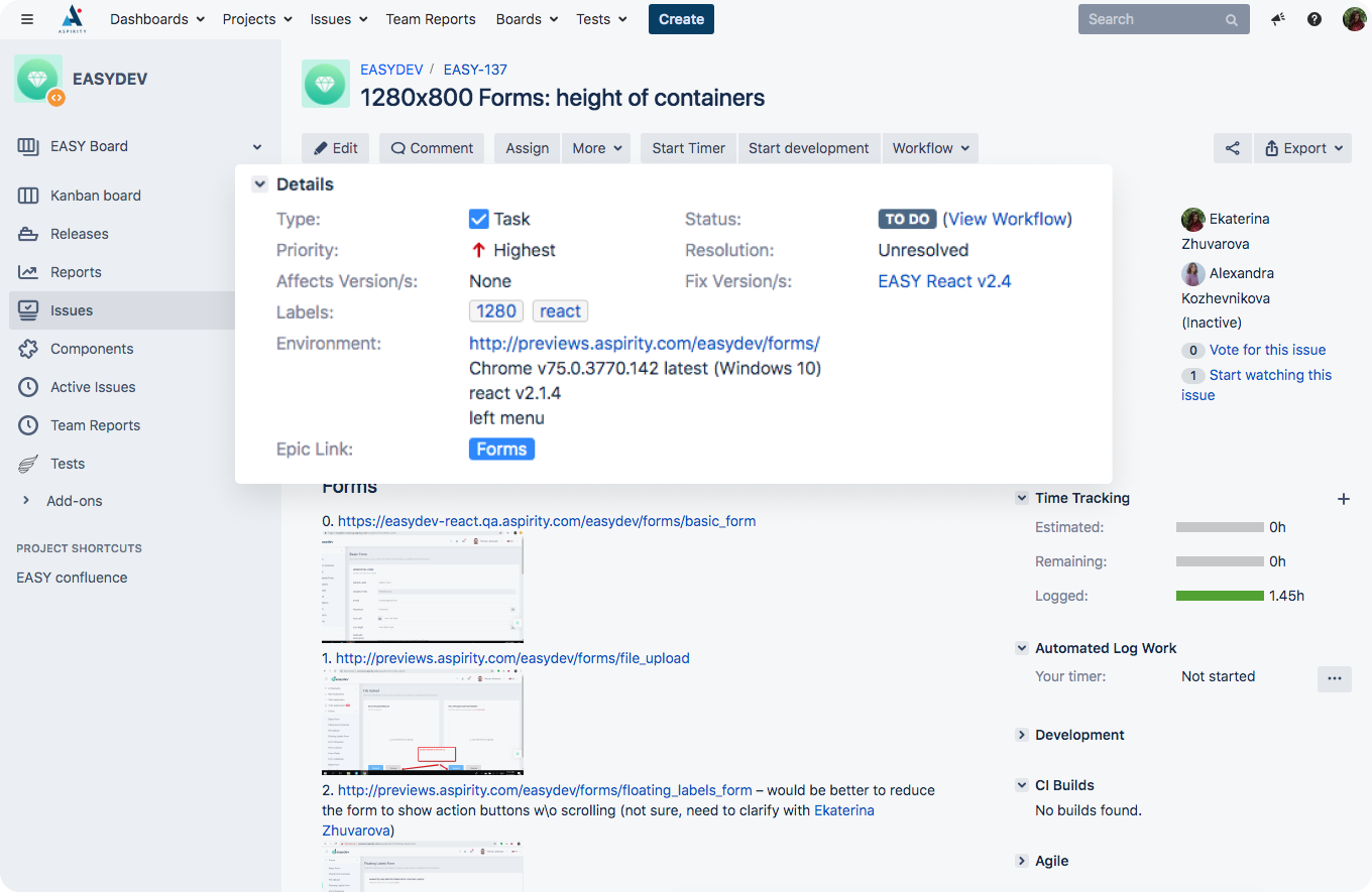
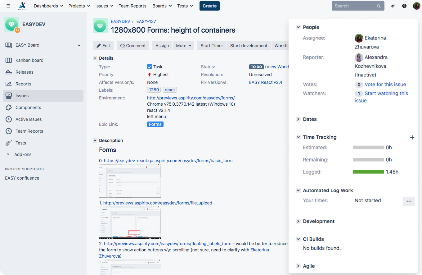
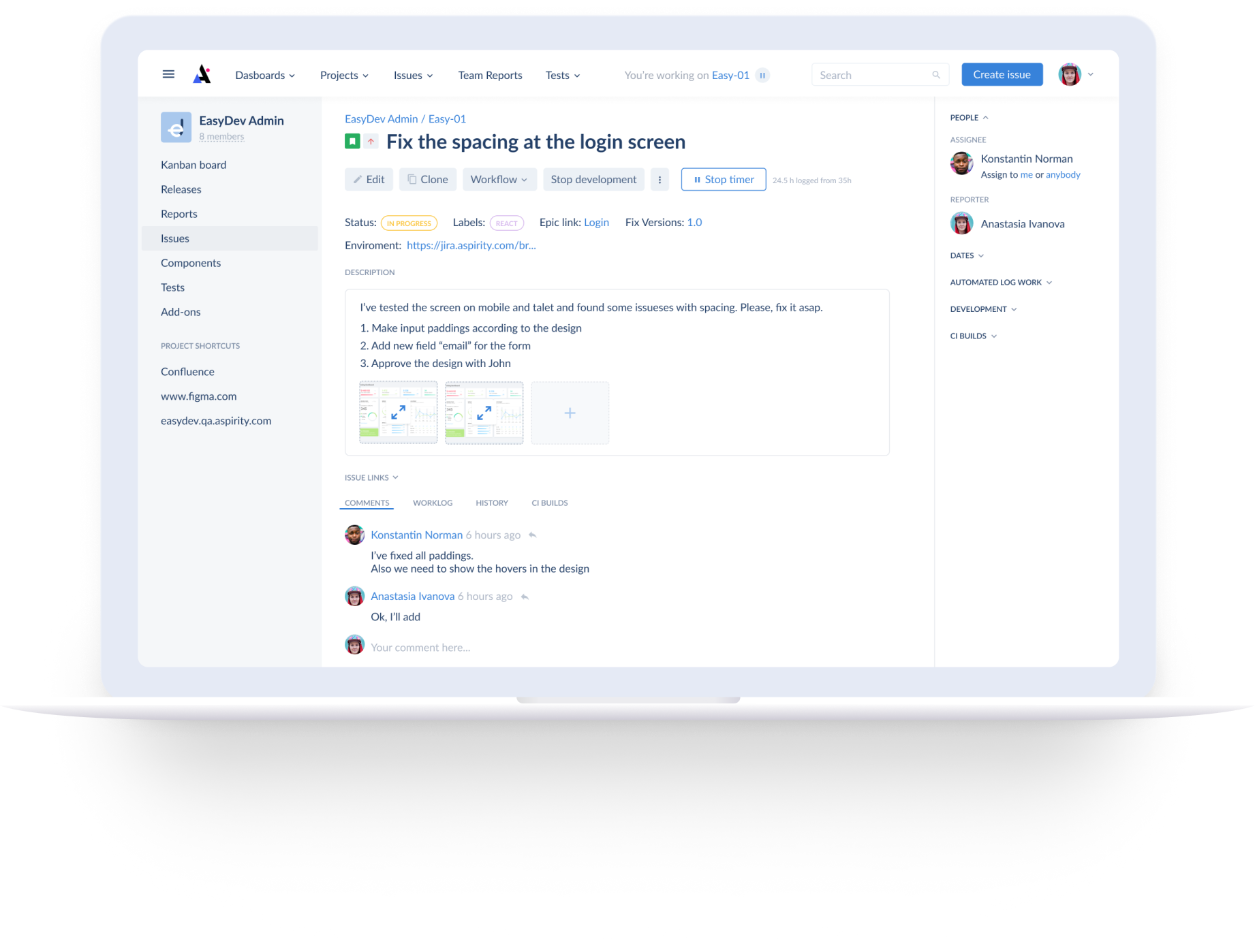
Due to work with Jira every day we face with some interface's inconveniences. The interface is full of details but not all of them are used frequently. Some of them grab users attention and confuse in some cases, for example, the sidebar menu with not obvious icons and wording or the buttons block under the task name.
Lets's see with details:
Lets's see with details:
What is the problem?


Jira Software is an agile project management tool that supports any agile methodology, be it scrum, kanban, or your own unique flavor. From agile boards to reports, you can plan, track, and manage all your agile software development projects from a single tool.
How we're going to solve it?

Reduce some buttons, highlight the timer button
We've removed the "Assign" button because it duplicates the same function in the sidebar and accented the "Start timer" button. The "More" button became smaller but didn't lose the sense
Configure available shipping methods
Too much details without prioritization
Connect and configure payment methods
Huge sidebar with duplicate information


Based on the results of the UX-research of the Jira interface we've made, we designed our own concept of the interface
The result
Thank you for watching!
If you want the same UX-audit and design suggestion just write to us and we will be happy to work with you!